


Introducing Rivery’s New Brand Look! A Guide to Our Fresh Image

Welcome to the new Rivery! We’re excited to launch our new brand look and feel, which is reflected in both our platform and our website.
It’s doubly exciting for me, as it gives me a fun and interesting way to introduce myself as the new VP Marketing at Rivery. I won’t bore you with my career background (you can always find me on LinkedIn), but I feel like this new look demonstrates why I chose to come to Rivery.
When I started the interview process with Itamar, Rivery’s CEO and Co-founder, I did my homework on the Data/ETL industry by talking with Rivery partners, competitors, and customers.
I discovered a few things:
- This is a crazy crowded space filled with loads of old school companies
- Data, no surprise, continues to be a booming industry – heard the term “digital transformation” lately?
- “Rivery has a fresh approach!”, “Rivery is hot!”, “Rivery brings the juice!” – (real quotes from industry players, BTW)
So what is the Rivery secret ingredient? Trick question. There isn’t just one thing, but here are two specific reasons why I joined up:
- Technical Creativity – Rivery’s roadmap is going to revolutionize the industry because creativity flows throughout the company, both on the technical and business sides of the enterprise.
- Customers Always Come First – Our customers rave about our support (in fact our support has won awards), and you can’t go wrong with a company that truly puts customers first.
The new Rivery brand look represents everything I came to the company for. But in order to understand how we evolved into our new image, we have to consider Rivery’s brand origin story. Even to this day, our originating ideals guide everything we do.
Rivers, Vikings, Ships: The Symbols of Our Brand Origin Story
Rivery started small, as all startups do, with just the co-founders inside a cramped office in Tel-Aviv. Back when Rivery was composed of just the three co-founders, the team had to choose a name for the nascent startup, and they relied on their fascination with Nordic myths for inspiration.
The Rivery name was derived from Viking mythology. To the Vikings, the river was the source of all knowledge, an effortless flow that sowed their societies. So our team decided that our customers would not connect to “data pipelines,” but to rivers, seamless streams of insight. And taken together, these rivers of wisdom formed a single stream, the Rivery platform.
Of course, what is a company without a hero? In keeping with the theme, we adopted a hairy Viking to captain our ship. The Viking has no name, and that’s intentional. He is the pinnacle of the fearless seaman, one who wants no credit for steering our customers through the perilous waters of Big Data.
And then we have the ships! Vikings built the sturdiest, quickest, and nimblest seacraft, allowing them to dominate the waterways. This informed how Rivery’s platform was designed. Rivery was built to transport raw data through the ocean known as the internet, deposit it in the safe harbor of a cloud data warehouse, and equip it in the proper format, to win the war for business insights.
This is the history that anchored and informed our new brand look. So now, here’s what our new image is all about.
Rivery’s Brand Revamp: To Boldly Go Where No Viking Has Gone Before
As Rivery matured into an industry disrupter, we decided that our brand needed to grow as well. We’ve been hard at work refreshing our brand. This includes a spanking new logo, new design, a new color palette, and of course, new Vikings!
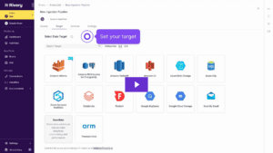
This week, you will start seeing our new visual language, which is being rolled out across all our sites, channels, communications, and Rivery’s DataOps management console.
From a new logo, to new colors, to new Vikings (he has a bunch of friends now!), this design refresh gives the company a fresh new vibe to leverage across all communications. Working alongside AHOY, a top-notch creative agency from Manchester, UK, we created this new design for all our brand communications, to help Rivery continue to stand out from the crowd.
New Logo: A River Runs Through It
Inspired by the ancient Runic symbols, our new logo combines Viking imagery with the Rivery symbolism. If you really dig this brand motif, check out Harald Bluetooth the Danish king who united Demark and inspired the Bluetooth logo that we know today.
Our new logo was designed to give the company a bolder, sharper image, something that catches the eye, while also symbolizing a centralized river in between our namesake.
![]()
![]()
New Vikings: Friends, Beers, Fun Times!
Our beloved hero got a makeover, too. After numerous iterations, a lot of debate, and multiple versions, there is a new style for our Vikings. This might have been the most challenging part of the whole project! We had to be careful – nobody messes with the Vikings and gets away with it.
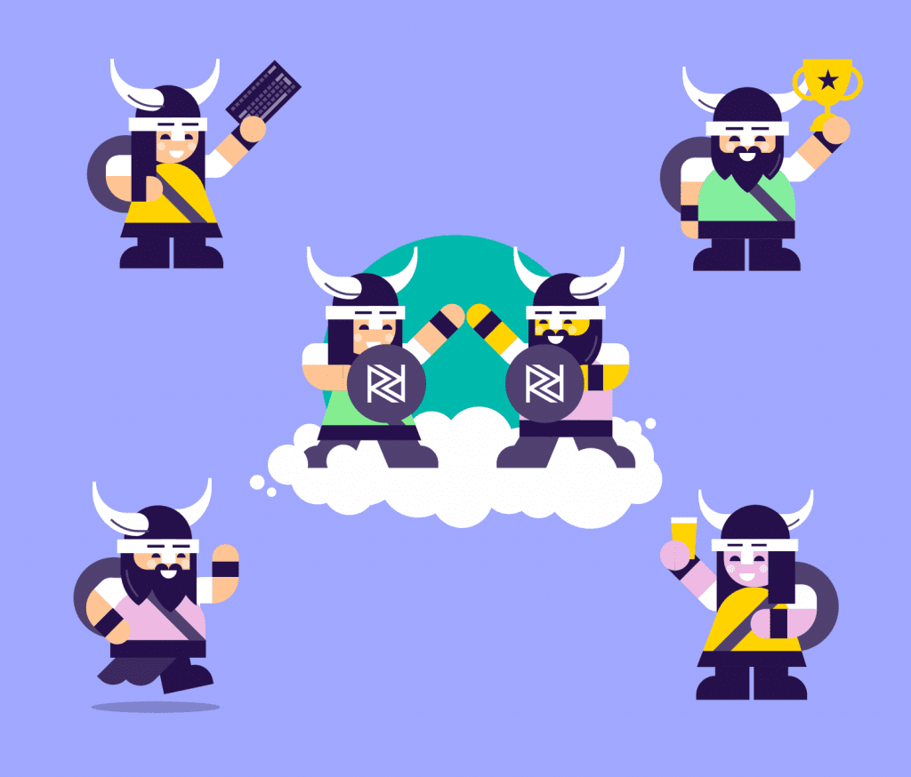
The new Vikings come in multiple shoes, colors, ages and genders – reflecting the diversity of Rivery’s team as well as our customers around the world.
Watch out for the appearance of new Vikings across our social channels – if you’re not following us on LinkedIn, Facebook, or Twitter this is a good opportunity to do so.
Tell Us What You Think!
The new Rivery brand look demonstrates why I came to the company. The creative life force of the imagery, symbology, colors, and more, perfectly embody our disruptive role in the industry.
And the evolution of our original brand represents a recommitment to our roots, as a customer-first company that strives to make our user’s data journeys as smooth as a river.
We look forward to hearing your thoughts and feedback on our new site, and our new design. Many of our customers have already formed a strong attachment to our old image, so we want to hear what they think about our spanking new look!
We aimed to create a fun and visually stimulating design language. Rivery’s team designed these visuals to be striking and memorable – to delight our customers, partners, and employees.
Our ultimate ambition is that you enjoy our new visual look as much as we enjoyed creating it.
Still reading? Check out this LinkedIn Post by Daniel Buchuk which dives deeper into the 6 month process.
Can't miss insights

Minimize the firefighting. Maximize ROI on pipelines.